
Why Credit Card Payment Options Confuse Users - ProductFTW #67
Paying a credit card bill should be simple. Log in, pick a number, submit payment, move on with your life.
In reality, repayment is one of the most complex user experiences in consumer finance. One specific aspect of that complexity is the repayment options themselves and how they are defined, presented, and explained to users.
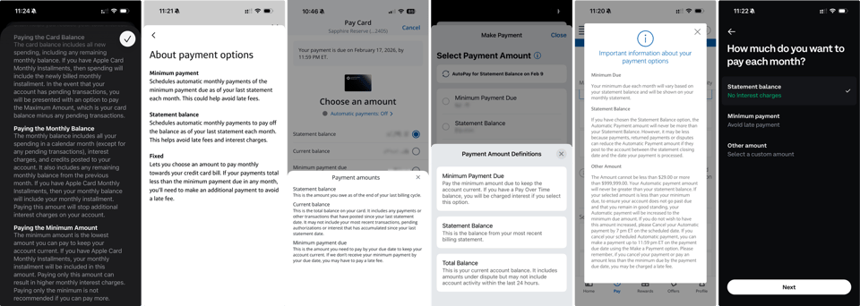
These sound straightforward: minimum payment, statement balance, current balance, and other amount. They are not. Each option changes how interest works, when it accrues, and how much the user ultimately pays, which is rarely obvious when you’re staring at the payment screen.
When I work on card products, I spend a disproportionate amount of time on repayment. Not because it’s exciting, but because it’s dangerous and I am paranoid. Repayment sits at the intersection of real money, regulation, math, and user behavior. You don’t get to be hand-wavy here. Every choice has consequences, whether the user understands them or not.
That said, “compliance made us do it” is not an excuse for a confusing experience. Product managers still own the UX.
Grace Periods: The Part (Almost) No One Understands
Before we get into the repayment options themselves, I need to touch on grace periods and how they actually work. I can’t avoid this part, because most of the confusion around repayment options only makes sense once you understand what a grace period is and when it disappears.
At Totavi, we spend a surprising amount of time explaining grace periods to people. Not because they’re obscure, but because they’re unintuitive. Even users who have had credit cards for years often misunderstand when interest accrues and which actions reset (or don’t reset) the clock.
Grace periods sit underneath every repayment option on the screen. Whether a user pays the minimum, the statement balance, or something in between, the real question they’re implicitly asking is the same: will this cause interest to accrue?
Here’s the rule most revolving credit cards follow:
- If you pay your statement balance in full by the due date, you keep your grace period, and you don’t pay interest on purchases.
- If you don’t pay the full statement balance by the due date, you lose the grace period.
- Once the grace period is gone, interest starts accruing immediately on any remaining balance. This is the part that surprises people: new purchases can also start accruing interest daily until the grace period is restored.
- Paying the balance down to zero does not automatically fix this. To restore the grace period, you usually need to let a full statement cycle close with a zero balance, then pay the following statement in full. Until that happens, interest continues.
Most issuers work this way. Payments are allocated in accordance with issuer rules. Interest accrues daily. The grace period does not magically reset just because a payment is posted. None of this is obvious from a repayment button. Which is unfortunate, because that button is doing a lot more work than it seems.
Why Repayment Options Are Confusing
Now layer that reality on top of the repayment options we give users.
Statement Balance
The statement balance is the amount owed at the end of the previous billing cycle. Once the statement closes, that number stays fixed until it’s paid down, no matter how much the user spends afterward.
Conceptually, it’s calculated as:
- Prior balance
- Plus new purchases, fees, and interest
- Minus payments and credits
- As of the statement close date
Paying the statement balance in full and on time is what preserves the grace period. From a product perspective, this is the most important option on the screen. If users misunderstand this one, everything else cascades.
Current Balance
The current balance is a real-time total of what the user owes today. It includes posted transactions, fees, interest, and payments. It does not include pending charges.
This number changes constantly. Every posted transaction updates it.
Users often assume paying the current balance is the “safe” option. Depending on timing, that is not always true. Paying the current balance does not necessarily preserve or restore the grace period, and most products do a poor job explaining that nuance.
Minimum Payment
The minimum payment is the smallest amount required to keep the account in good standing. It has a defined calculation and regulatory constraints.
Paying the minimum avoids late fees and delinquency. It does not avoid interest or preserve the grace period. And over time, it can be very expensive.
From a UX perspective, this option needs especially clear language. Paying the minimum is not a neutral choice, and treating it like one is misleading.
Other Amount
“Other amount” looks flexible and user-friendly. It’s also where things get risky.
If a user enters less than the minimum, there are consequences: late fees. potential delinquency, and credit reporting impacts. This option needs guardrails and explicit warnings, not just an empty input field.
Where Product Teams Usually Go Wrong
Most teams default to what traditional issuers have done for years. They drop a lot of explanatory text on the screen. Paragraphs describing what a statement balance is, how a current balance is calculated, or why minimum payments exist.
Users don’t read those paragraphs at the moment they’re making a payment. They skim, or they ignore them entirely. Then they pick a number and hope they didn’t just mess something up. Hope is not a great repayment strategy.
What users actually want to know is much simpler:
- Am I going to pay interest?
- Am I going to be penalized?
- Is this going to hurt my credit?
- Did I just make a mistake?
Most repayment experiences don’t answer those questions directly. They explain the mechanics and assume the user will infer the outcome. That’s a big assumption, especially when real money is involved.
The better experiences flip this. Instead of leading with definitions, they lead with consequences. They make it obvious what happens if you don’t pay the statement balance in full.
Examples That Do This Well
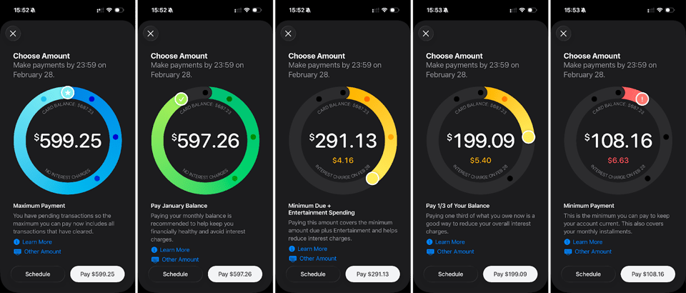
Two repayment experiences I consistently point to are Apple Card and the Coinbase credit card. Both prioritize clarity over abstraction. They make it obvious what happens if you don’t pay the statement balance in full.
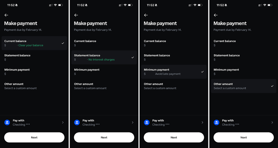
Apple Card, in particular, shows the dollar cost of carrying a balance, not just an APR, and goes a step further by clearly showing the payment cutoff time. It also saves users from doing math they were never going to do anyway.
What I Optimize For
When I design repayment flows, I’m not trying to be clever. I’m trying to eliminate ambiguity.
I want users to know, at the exact moment they select a payment amount, whether that choice will cost them interest. I want outcomes to be obvious without forcing people to understand billing math or issuer rules. Lastly, I always assume that grace periods are misunderstood, because they almost always are.
Repayment is not a settings screen you visit once. It’s a monthly decision that shapes whether users trust your product or feel like it tricked them. When you get it right, no one thinks about it. When you get it wrong, everything else feels suspect.
That’s why repayment options are real product work. Turns out the boring-looking text on the payment screen matters more than it seems.
About ProductFTW
ProductFTW is a weekly newsletter about product management, with a focus on real-life experiences in startups. We want to help product leaders be successful by giving realistic approaches that aren’t for giant tech companies. We know you don’t have a full-time product designer on each team. We know your software probably hasn’t been used by millions of people worldwide–yet. We’re here to bridge the content gap from building your product and team to scaling it.
Part of the Fintech Product Management Field Guide — ProductFTW's writing on what makes building card, payment, and banking products different.